All newsVladimír Mokrý: UX designer fights for his users. Graphic designer fights for his ego

With Vladimír Mokrý about the biggest difficulty when designing web pages for Bileto, about idealized start-up reality, and about dance as a kind of exercise which makes sense.
Vladimír on the edge between an artist and designer generates ideas for his work. During his studies of Teaching Arts, he visited England, where he realized the drawbacks of Czech educational system. He is developing community living Techsquat where he and his flat-mates test start-up ideas. He co-founded the project Kdyjedes which helped people find their friends on trains. He is now making good use of his experience from the field of transport in Bileto in which he has been participating since its very beginning.
How are you doing in Bileto now?
Hi Vojta. We have taken some significant steps recently. We have tested that we are able to sell tickets. However, we are not here just for Czech market. We are building a global platform enabling the carriers to manage their business completely – from entering their schedules and price lists, specification of their vehicles, clever seating and yield management to benefits for loyal customers via elaborated loyalty system. What you can see on Bileto.cz is just the tip of the iceberg. The essential is happening below the surface of the water.
What is the situation with mobile applications?
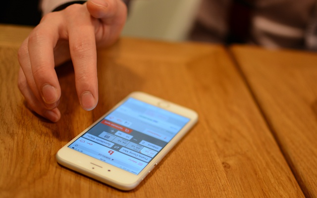
We are working on them. A few weeks ago, I finished guerrilla testing of shopping process in Prague cafés. And you would be surprised how people get excited when you ask them for help with user testing instead of offering them supplementary pension insurance or budget-wise phone tariff. Some of them even accepted invitation for coffee.
However, applications are not critical for us. One of the principles we enforce in Bileto is mobile-first. And with that we really mean to truly think about all processes in the dimension of displays of phones, phablets and tablets. It is very interesting to watch the trends. Perhaps the future is in erasing the differences between web and native mobile app. Web applications of the future will be able to store the data offline or call a notification in platform environment. Some experts are even of the opinion that users are already overloaded with apps and the time will come when they will not be willing to add another shiny icon on page seven. And the question is whether some new principles in work with native applications appear, either in the form of widgets or intelligent notifications. If we create a web application which is able to operate it all, the customer will be able to purchase the ticket anywhere.

Have you been thinking about Bileto in this way since the beginning?
No, there was no time for that. Today, it is not that much about the fact that a person is necessarily on the move when using the phone. This premise is not correct. People use their phones anywhere and they want to get to all functions of the app. So the very first decision to make Bileto mobile-first was, in my opinion, the right way.
What was the most difficult when designing the web for Bileto?
When you have a look at homepage, you will find there a bar with days. We are quite proud of it. There are not just data, but you can easily find e.g. Monday and also realize how far it is. And you click. Other servers still have just tiny jQuery calendars. We have found out that people need to search maximally four or five days ahead.
That´s wonderful. I haven´t even noticed. I took it for granted.
Exactly. I am happy you are saying this. These are all small things, but together they build up the user´s experience in such a way that the user often doesn´t even notice.
Idealized start-up reality
What is actually your job description? Do you have the keys from Bileto´s visual language?
My business card says I am Art Director, but the situation is a bit more complicated. I am in charge of two areas. The first one is checking brand consistency, i.e. that our brand communicates unanimously with the public, no matter whether with the end user, passenger or our customer from the ranks of carriers or business partners. And this does not concern only the visual part. In a broad sense meaning, we perceive the brand also as the corporate culture or manners of my colleagues. Although we sell just tickets, I want the people to have the feeling that they meet product which is being built with care, expertise and sense for detail.
Second area is product design and passing the direction and vision to my colleagues. Here, you can imagine the web application itself as you know it from bileto.cz, graphics of the interface and user´s experience (User Experience – UX) from the shopping process. Friendliness of the administration for the carrier or graphic design of the apps for mobile phones. This clearly shows that it does not really matter what people have on their business cards (laugh).
Which of these areas do you enjoy more? To teach and lead the team or the executive part?
I really like the scene from Gladiator with Russell Crowe where one of the supporting characters says: “Sometimes I do what I want to do. The rest of the time, I do what I have to.” This quotation sets right the idealized start-up reality. The moments when we make illustrations or work creatively on printed materials are more rare and we try to enjoy them. As I have already mentioned, the main content for me is generally product design and User Experience.
Let´s get closer to User Experience. What characteristics should a good UX designer have?
There are certainly more competent people in the Czech Republic to answer this kind of question, e.g. Berka, but if you want me to answer: The term User Experience has recently come to the fore, but in reality, it is just a trendy name covering the spheres which have been long discussed by psychologists, interaction designers, anthropologists, sociologists, graphic designers or information architects.
I will stay on the general level in the field of internet apps. Each web has its own goals. It is not important whether you need to find a phone number for washing machine repairs, food delivery or purchasing a train ticket. If the customer gets to his goal without any delay and has a positive feeling from this process so that he would like to experience it again, then the web works well.
The UX designer contributes a lot to the quality of this process. A good UX designer is constantly thinking about the product, he is testing it, he is drawing wireframes, creating prototypes and he also goes outside. Simply, without the opinions from common people, your customers, you do not have a complete overview of the situation. So what you do is this: you give people a prototype with assignment: “Purchase a combined ticket from Prague to Šternberk.” “That´s actually possible?” will be the answer you get. Then you follow their interaction, how they proceed, where they click. After that, you assess it and prepare new version.
So the important thing is to keep some distance, to be able to leave your expertise and try to understand a common user and his needs.
Yes, this is exactly what my colleagues say. The UX designer actually fights for users. The graphic designer, on the other hand, has his ego and he attempts to make his work as beautiful as possible. And I am currently in both positions.
How many people do you have in Art Department?
Right now we are four. Tomáš is responsible for front-end and UX, Adam helps with the code and we also have graphic designer Kristína who has broad knowledge ranging from classic printing to digital illustrations.
How do you pass your idea of how Bileto shall work to graphic designers?
I am a teacher by profession. I studied Teaching Arts at Masarykova University. Besides drawing, painting and craft skills, I shall be also able to pass the knowledge on. And as I lead the team, I try to assign the tasks in such a way that my colleagues have as many solutions as possible at their disposal and enjoy also the process.

Where do you get inspiration?
Recently, I have been interested mostly in web pages which are perfect in all aspects. For instance Virgin America, fine-tuned mobile-first experience in air ticket booking. The flow is so modern and timeless that I am asking myself if it can be an inspiration also outside the proven American audience. If the interface could be used also by our parents who often don´t even have experience with smart phones. Take for instance the icon for saving – How do you imagine it?
Arrow down – something like download.
For me, it is a floppy disc, because I remember it. And now think of the generation Z, thirteen or fourteen years old users who are very good at using computers and phones since early childhood. That is why they have problems with concentration at school and teachers are often not able to attract their attention. Children of this generation have never seen a floppy disc. That´s it. How can I use this pictogram for saving in Bileto if I know that only my generation and middle-age generation will understand it? And there are more things like this. Suddenly, you have symbols whose real image has disappeared.
Lindy-hop and Techsquat
How do you prevent yourself from repeating the same ideas in your job?
So you ask about my hobbies.
Let´s say yes.
I enjoy drawing. And I also like dancing – swing and lindy-hop. If I have to move, I want it to make some sense and dance does make sense.
How did you start working as a designer?
I was a freelance designer during my studies. I was doing web design, brands and printed materials. School provided me with some art background – I was taught to draw and express myself in an artistic way. Today, I draw inspiration from art as well as design.

What were you doing after you finished studies?
After university, two and a half years ago, I went to live to Techsquat in Brno.
What is its main point?
Techsquat has been conceived like this: Let´s find people who have interesting skills and feel like creating, and let´s give them some space to share. Each applicant has to go through an “interview” where his or her personal vision is discussed. In this way, there is a community of people who share more than just the need to take out the rubbish and wash the dishes. The projects then arise from this sharing. I recommend all young people to try out this kind of living.
Last question: What is actually the biggest added value of Bileto?
We have a high-quality shopping process. The visitor goes through it in four steps and gives the carriers tools to learn about their passengers and offer them tailored services. In the new version, which is to be launched in a few months, we have dealt well with displaying and selling of combined journeys.
